Clothing Ecomms Sites
I worked with MCR Collective to create brand new websites for its various e-commerce fashion brands to ensure they were seamless and enjoyable from a user perspective.
THE BRIEF
My task for each site was to carry out a shortened UX research process, examining stakeholder information, situational analysis and expected and organic competitors. I would then go on to facilitate a client-facing workshop and subsequent impact mapping. From this, a client report would then be produced to relay this information back to the client. I was then to work on information architecture and user flows for Madison Barclay, ATSG, Blood Brother and Altryn.
SOLUTION
The outcomes from the project were that I carried out the research and analysis phase successfully, facilitated the workshop and fed back to stakeholders effectively, and then collaborated with the UI designer to produce the information architecture and user flows, before handing off the project to the UI designer to produce the wireframes for each site.
RESEARCH
STAKEHOLDER INTERVIEWS
During stakeholder interviews, I would ask stakeholders questions over a video call, and would compile notes as they gave their answers. I asked stakeholders about their business organisation, who was involved with the project, points of contact, and their desired perceptions of each fashion brand and how it is to be positioned creatively in its market.
I’d also ask about expected competitors, perceived strengths, weaknesses, opportunities and threats. I would check to see if the company carried out user surveys, or it had a platform to host a survey on. I would also ask for audience demographics, marketing strategy and goals, and KPIs.
I’d also pose UX-related questions, such as which conversions each brand was prioritising, how they planned to track user data. I’d also ask any questions that had been passed on from the UI or dev teams. At this stage, I’d assess all answers compiled and collate the information into a document that was shared in the project channel with the wider agency team.

SITUATIONAL ANALYSIS
Usually, it is common practice to include analytics data in a situational analysis, but as these websites were new and being built from scratch, there was no analytics data available to use.
I’d use information from the stakeholder interview to create a SWOT diagram for each site, and would also use an AI to construct an overview of the industry it was in.
COMPETITOR RESEARCH
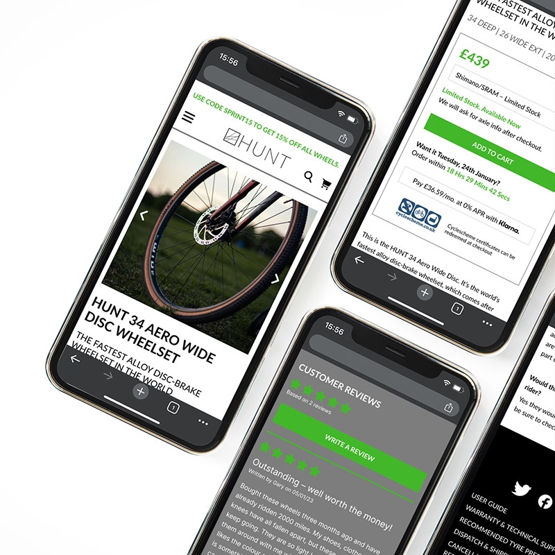
I started off by analysing the expected competitors from each stakeholder interview. I then used Semrush to get an overview of SEO keywords for each site, and competitive positioning. This would give me further information on organic competitors that I could then examine in more detail.
This information and screenshots were made available to the UI Designer for reference while creating wireframes.
ANALYSIS
AFFINITY DIAGRAM
The affinity diagram for each site would be populated with data from the stakeholder interviews, as well as situational analysis and competitor research.
This was then carried out by a small in-house team, and the output from the affinity diagram was then fed into the workshop.
CUSTOMER JOURNEY
The output from the affinity diagram was collated into a customer journey map to clarify user context, mental models and pain points for each site. This was also fed into the workshop.
WORKSHOP
The client-facing workshop was conducted via a video call, along with the UI designer, project lead, dev lead and the client.
A design-thinking model was used to sort through the output from the affinity diagram, and to create solutions to pain points. The workshops were typically quite short, because the project had small amounts of data to work with.
IMPACT MAPPING
The solutions from the workshop were then impact-mapped internally by a team consisting of myself, a UI designer, project lead, dev lead and marketing executive.
During this process, we categorised each solution depending on whether it was low or high impact, and low or high effort. The solutions were compared to the statement of work produced for the client, to identify if any of them were out of scope.
Once this was done, these solutions were then documented into the client report.
CLIENT REPORT
All of the information gathered so far during the research and workshop phases was put into a branded report that was shared with the client.
The report contained a summary of the project, the information from the UX research, the outcomes from the workshop and impact mapping, and a conclusion and roadmap for the rest of the project.

DESIGN
INFORMATION ARCHITECTURE
I worked with the UI designer to map the information architecture for the planned new site. We took into account customer journeys, mental models and the perceived pain points users may experience.
USER FLOWS
Using the information architecture diagram, I constructed several user flows for the new sites, top level ideal purchase flows, and several other more detailed flows assessing factors like password reset, user account logins, past order history views, etc. These then fed into the UI design and the sites’ development.
CONCLUSION
My goals for this project were to conduct the UX research and analysis so that it could inform the UI design and the development of each new e-comms site. These were completed successfully, and I received good client feedback. The client approved the reports without changes, and I received great feedback from the UI designer on my team, who was a pleasure to work with.
From this project, I learned quite a lot about tailoring the output of the research and analysis so that it provides useful guidance to UI design and development.