Listing Website UX Project
Although the client had a huge amount of organic search traffic, it also had a very high bounce rate and a very low conversion rate.
THE BRIEF
My brief was to carry out a thorough UX study of the client’s website to uncover user pain points and present solutions.
SOLUTION
During the project, I conducted the research and analysis, including in-depth user interviews. A number of issues with the user flow and user pain points were discovered. Recommendations and solutions were suggested for these, and presented to the client.
RESEARCH
SITUATIONAL ANALYSIS
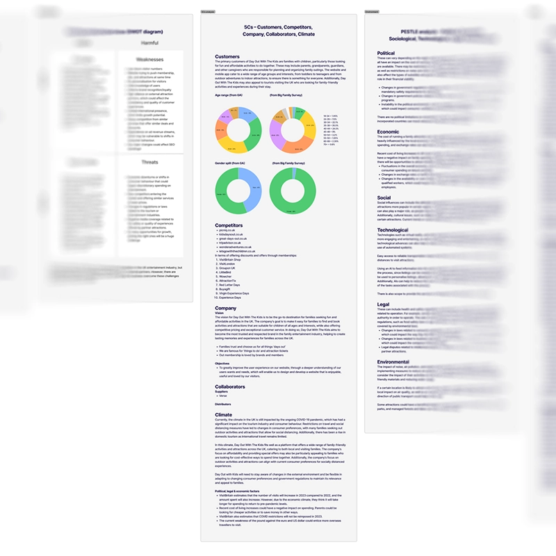
I carried out a situational analysis using data from Google Analytics and Microsoft Clarity. I also created a SWOT diagram, a 5Cs analysis, a PESTLE analysis and a VRIO analysis to construct an overview of the client and the market they were operating in, although these aren’t actual UX tasks, and are normally undertaken by marketing experts.
USER SURVEY
The client was to launch a user survey through its website, and I advised on which questions to ask. Once the survey and results were back, I cleaned the results and analysed the information. The results for the survey were then used to set up user depth interviews.
Several points of concern were raised by the survey results, including users being unable to find what they were looking for on the site, and users not booking through the website because they found cheaper prices elsewhere.
COMPETITIVE BENCHMARKING
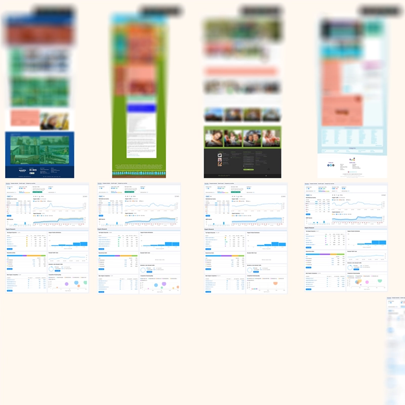
The main performing pages from the client website were benchmarked using Lighthouse and Semrush to study organic search terms, organic competitors and competitive positioning. This also uncovered that some of the main pages were performing badly.
Following this, the main competitor websites were benchmarked for the same results, and also visually benchmarked. This illustrated that many of the competitor websites performed badly, and were not designed in an accessible manner.
INFORMATION ARCHITECTURE OVERVIEW
I plotted out the information architecture of the site. I discovered that the client site and categorisation of pages was very complicated, and that the client’s membership paywall was separated onto a microsite.
CLICK-TRACKING
Click tracking was assessed using Microsoft Clarity, and uncovered a high amount of rage clicks and dead clicks on the majority of the slideshows and other UI elements across the site.
USER FLOW ANALYSIS
I used information from Google Analytics to investigate user flows on the client site. I looked at three top-level user flows, to try and understand how visitors were moving through the site.
I discovered a lot of bouncing back and forth between category pages and product pages, suggesting that visitors were not able to find what they were looking for.

CARD SORTING
Using Usability Hub, I performed some blind tests and a card sort to test the categories of the product pages for the website. I found that although some pages performed well in terms of categorisation, there were others that performed badly.
A/B TESTING
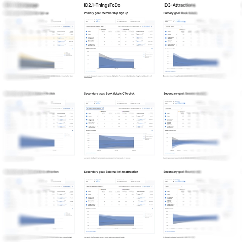
Because the user survey had raised some concerns over the density of advertising on the client’s site, it was decided to conduct several A/B tests using Google Optimize. This was to find out whether reducing the density of advertising or removing advertising altogether would help increase conversion.
Unfortunately, the client hadn’t installed Google Optimize properly, and although the results indicated an increase in conversion (with the removal of advertising), the results were not conclusive.
USER DEPTH INTERVIEWS
I suggested doing some user interviews, and the client gave us details for a GDPR-complaint mailing list so that we could get permission to contact more than 600 users. From this number, we managed to do 50 interviews.
We conducted the user depth interviews remotely, and asked some personal questions to build up demographic information, and specific product questions that were directly related to the website.
From the interviews, we found several consistent themes. Users wanted more variety and choice on the website, and also wanted more discounted rates. Users also wanted a native app along with push notifications and quality-of-life improvements like previous searches and favourites. One major observation that repeatedly emerged was the need for improved filter functionality.
ANALYSIS
PERSONAS
Although I have doubts about the validity and value of generating personas, it was decided that the client would benefit from having the demographic information presented this way. Four different personas were generated to present the four main demographic sections, and these were presented to the client in the final report.
AFFINITY DIAGRAM
All of the data from the situational analysis, user survey, benchmarking, information architecture, click tracking, user flow analysis, card sorting and A/B testing results, and the user depth interviews were plotted into an affinity diagram for an assessment.
The outcome from the sorting reinforced pain points already discovered, including a user desire for more robust location tools, problems with a ticket-booking plugin, rage and dead clicks, a user desire for native app functionality, and a badly-performing search function.
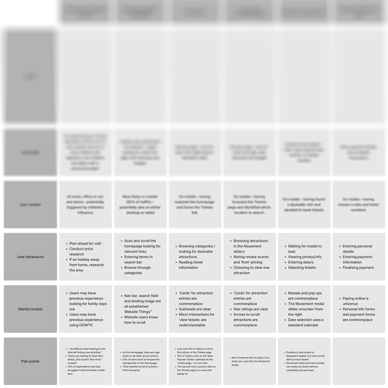
CUSTOMER JOURNEY MAP
Because there were a number of user flows we wanted to consider, I generated four customer journey maps. These covered landing on the site, ticket sales, creating a membership account and a user flow that specifically referenced what we found in Google Analytics.
Doing this clarified where the pain points identified were occurring in the user flow.
RESEARCH & DISCOVERY REPORT
This report summarised everything discovered, in one comprehensive document including quantitative data, situational analysis, benchmarking, competitor information, user-depth interviews information, card sort findings, click tracking, personas, user flow analysis, A/B testing findings, affinity diagram outcomes, and a summation of all of the problems, and recommendations to resolve those problems.
This was sent to the client, and used as a basis for the two-day workshop.
WORKSHOP
IN-PERSON 2-DAY WORKSHOP
I attended a workshop at the client’s premises that lasted two days, which was based around a design-thinking model. The team spent the first day assessing and investigating the pain points in more depth, and discussing which pain points needed greater priority in being resolved.
On the second day, the team came up with solutions to the issues raised, and investigated each solution in fine detail to assess how feasible it was to apply.
IMPACT MAPPING
The solutions from the workshop were then impact-mapped internally. During this process, we categorised each solution depending on whether it was low or high impact, and low or high effort.
CONCLUSION
My goals for this project were to conduct an exhaustive UX research and analysis study to uncover and address existing paint points with the client’s site. Many problems were uncovered, and these and the solutions to them were workshopped with the client and presented to them in a thorough report. The client was very pleased with the work undertaken, and chose to enter into an ongoing working relationship on this basis.
I learned again the importance and value of spending time gathering qualitative data. Even small amounts of qualitative data gives so much more information than quantitative data. Quantitative data tells you what is happening, qualitative data tells you why it is happening.