Comeback Catz Native App
Overview
Comeback Catz is a mobile app designed to help users respond to everyday microaggressions and confidence knocks with quick-witted, empowering comebacks. The app blends gamified interaction with a supportive community, encouraging users to celebrate personal wins, learn new responses, and boost self-esteem.
My role was to lead the UX design, focusing on user flows, interactive features, and UI consistency to create a welcoming, playful, and motivational experience.
The challenge
Many people face situations where they struggle to find the right words in the moment, whether they're dealing with bias, unwanted comments or self-doubt.
Comeback Catz aims to:
- Provide users with a bank of ready-made, humorous comebacks.
- Enable them to record and celebrate personal achievements.
- Foster confidence through positive reinforcement.
The challenge was designing an interface that:
- Felt fun and approachable, while addressing serious topics.
- Was easy to navigate for quick access during high-pressure moments.
- Encouraged ongoing engagement without feeling like homework.
My role
UX Research & Wireframing: Used Lyssna to conduct user surveys, mapped journeys and created low-fidelity prototypes.
Interaction Design: Built intuitive flows for the entire app, including sign-up, profile management, comeback selection, community engagement and recording personal achievements.
UI Design: Applied a bright, playful aesthetic to encourage positivity, personal connection and gamification.
Usability Testing: Conducted iterative feedback sessions to refine navigation and layout.
The process
1. Discovery & research
- Interviews with target users to identify pain points in handling real-life confrontations.
- Competitor analysis of confidence-boosting and self-help apps.
- Established tone: empowering, witty, and safe.
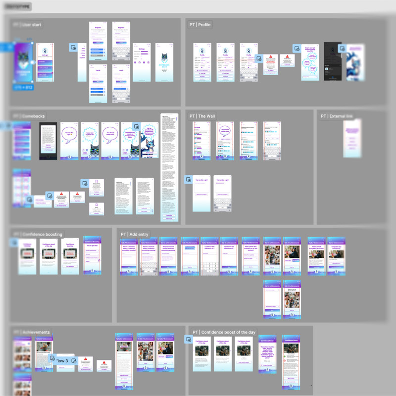
2. Information architecture
Organised features into four key areas:
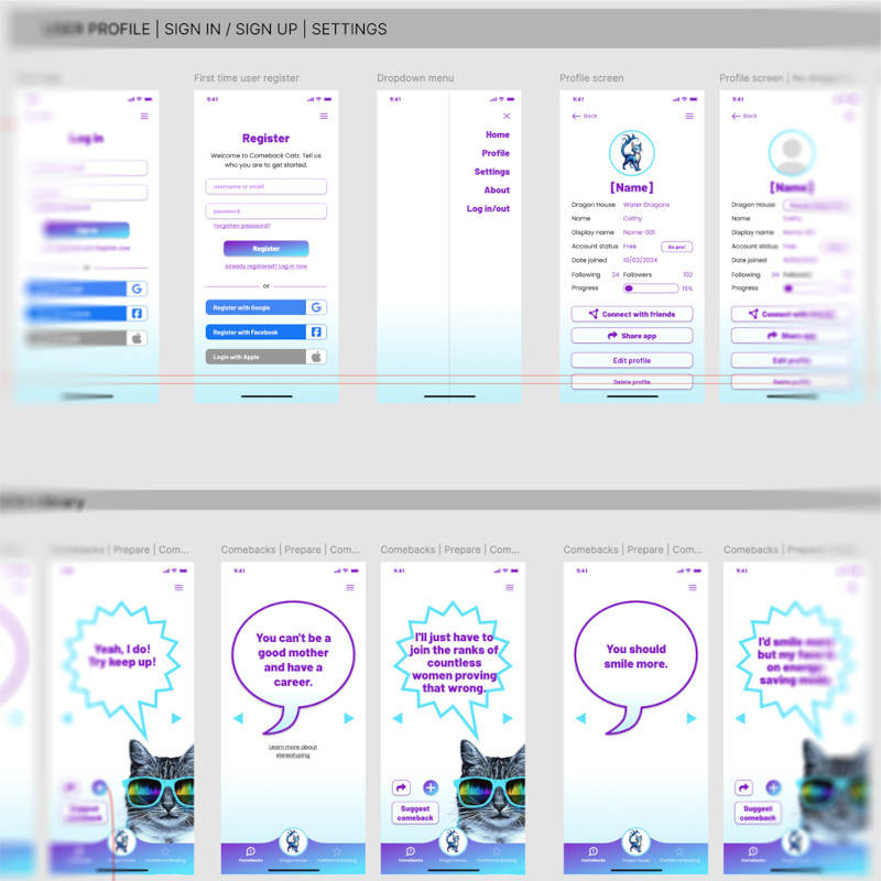
- Profile – Personal details, progress tracking, and settings.
- Comebacks – Quick access to witty responses.
- Hall of Achievements – Users log milestones, upload photos and celebrate wins.
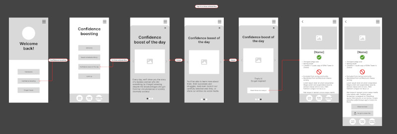
- Confidence Boost of the Day – Daily prompts and encouragement.
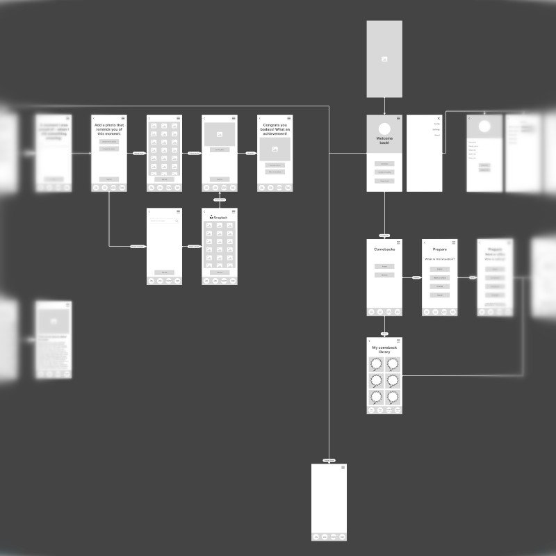
3. Low-fidelity wireframing & architecture
The architecture for the app was planned as low-fidelity wireframes to establish the structure and user flows at an early stage.
This was an essential step in preparation for the planned three-day live Hackathon, which was intended to jump-start development.
4. Live hackathon
I was the UX/UI lead heading up a team of international UX designers and a UX writer/copywriter. The team was based across several different time zones and we worked in Figma collaboratively to quicken the development process and get the app towards a suitable state for launch.
A large part of the app screens were created at a high-fidelity level over the three days making the Hackathon an astounding success that the client was extremely happy with:
David's approach to UX design is nothing short of magical. He has a unique ability to deeply understand the user's perspective, connecting it with the project's goals to create user flows and wireframes that were intuitive, engaging, and above all, effective. Moreover, David's expertise in leading the UX team was evident throughout the hackathon, where his leadership ensured seamless collaboration and innovation.
5. High fidelity wireframing & prototyping
Following on from the Hackathon, the high-fidelity wireframes were reworked and expanded upon based on developers' feedback and newly-presented case scenarios. The majority of the entire app was wireframed at a high-fidelity level to ensure a high level of detail on each screen and also to work towards a functional hi-fi prototype.
With this in place, I was able to create a clickable prototype covering the established minimum viable product, including first-time user flow, comeback browsing and achievement logging.
6. Testing & iteration
As part of the testing process, observed users navigating the prototype from onboarding to logging their first achievement. The results from this testing were used to further develop the onboarding user flows.
We also tested user flows for confidence boosting, community engagement, achievements library and profile management.
Key features designed
Quick sign-up & login: Multiple options (Google, Facebook, Apple) for faster onboarding.
Comeback carousel: Swipeable interface for browsing responses, with “Suggest a Comeback” option.
Hall of achievements: Add milestones with date, photo and notes; edit or delete entries easily.
Profile dashboard: Track followers, following, and progress with a clean layout.
Daily boost: A motivational message or tip displayed every day.
Outcome
The prototyped flows and interface:
- Reduced onboarding pain points
- Increased repeat usage during alpha testing
- Received positive feedback from the client, Rhiana Spring, for its playful tone and usability.
Takeaways
This project reinforced the importance of:
- Matching tone of voice to the emotional context of the app.
- Building frictionless flows for users to tap into and learn from, building knowledge that they can rely on in difficult situations when they are experiencing bias.
- Balancing fun aesthetics with functional clarity.
-