Hunt Bicycle Wheels
I was approached for a quick project looking at a single product page for a bicycle wheel manufacturer.
The research for the UX of the site had already been done – my role was to look at the research and analysis and advise how it could be applied to the existing page.
THE BRIEF
My task was to take the research report already created, look through the information, and carry out any further research I deemed necessary. I was then to produce hi-fidelity wireframes for desktop and mobile versions of the page, incorporating the changes I would recommend.
SOLUTION
I redesigned the page with an eye to making the information more clearly laid out and accessible, while reducing clutter and extra information that could lead to user overload.
I was informed by the client that my conclusions and designs tied in with their overall approach to the project – they were happy with my work and I received good feedback.
RESEARCH
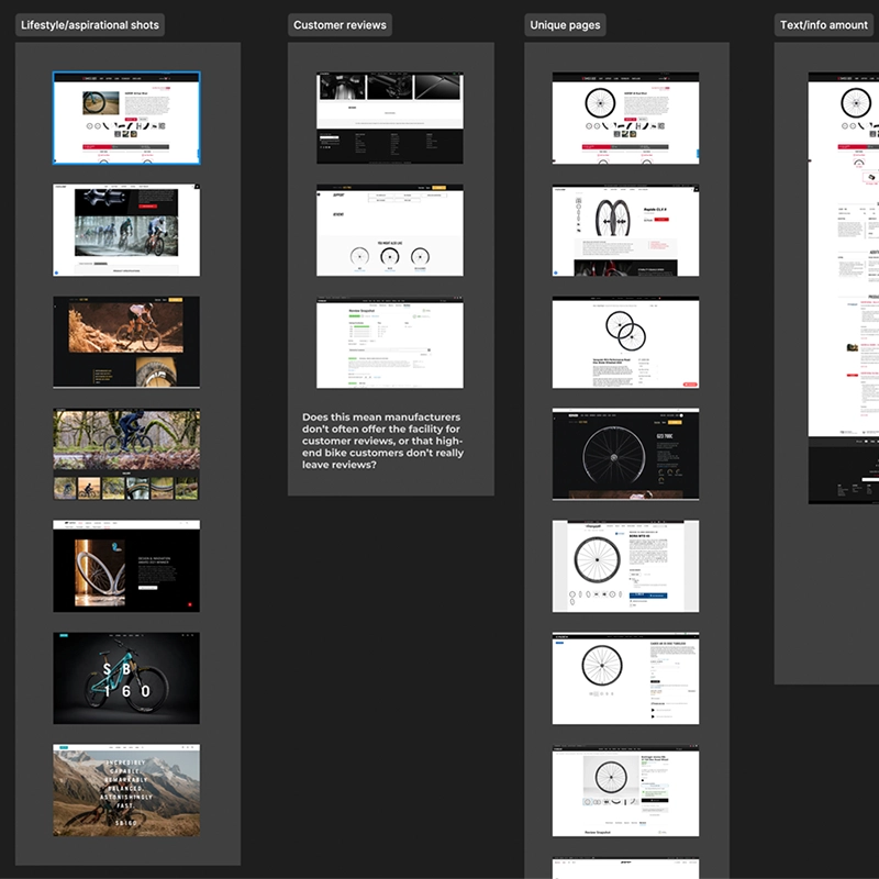
COMPETITIVE BENCHMARK
The client only had a couple of market competitors identified, so I took some time to identify a few more.
The provided research suggested that the product photography on the page was all very similar, that customers were struggling to differentiate between products, and that customers were getting overwhelmed with information. With this in mind, I looked at some very specific areas of the competitor websites:
- Use of lifestyle and aspirational photography
- Implementation of customer reviews
- Product page layout
- Amount of text on the page
ANALYSIS
CUSTOMER JOURNEY
Although a number of pain points had already been mentioned in the research report, I decided to create a simple journey map to include information from my own research. Several things came to light:
- The product photography was good, but wasn't relatable
- The tech information on the page wasn't relatable
- The tech information was overly technical and difficult to understand
- The CTA for buying the product was confusing and cluttered, with the added problem that the 'add to cart' button didn't display properly on mobile devices
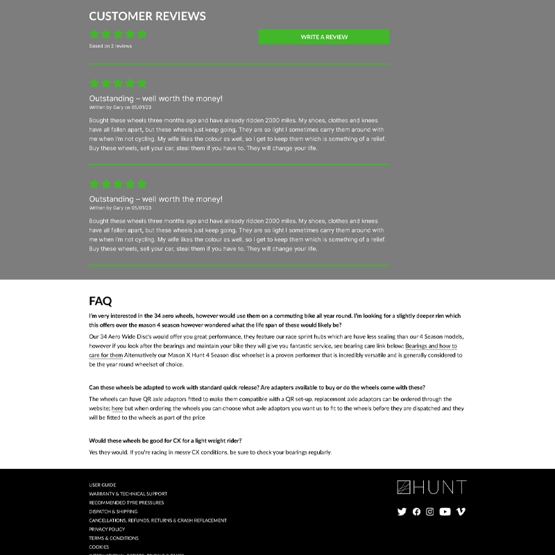
- No customer reviews
- Payment options were confusing and unclear, with extra payments added without warning

AIMS & IMPROVEMENTS
At this stage, I wrote a 7-step program to improve customer interaction with the product page:
- More lifestyle and aspirational shots
- Add customer reviews
- Make product pages more unique
- Link to social media (feed to page rather then outgoing links)
- Reduce the amount of text on the page
- Make copy more relatable (reduce jargon)
- Improve the payment dialogue and make more of Klarna
USER FLOW
I was requested to submit a user flow for the page design. Without stepping outside of the page, this was difficult, but I was able to add a user flow for the page in terms of what users saw and when as they interacted with the page.
Since this was so straightforward, I just wrote a list for the new flow.

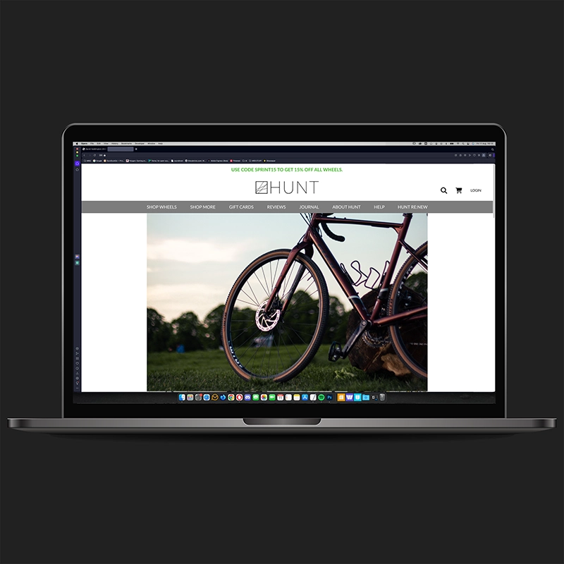
DESIGN
WIREFRAME & UI DESIGN
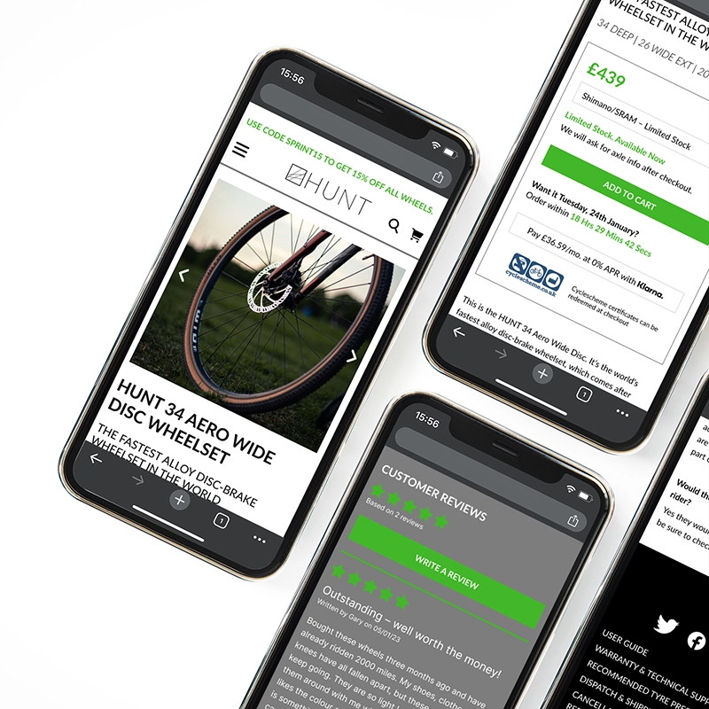
With the list of improvements and the new user flow, I was tasked with producing a hi-fidelity wireframe that addressed the problems.
The style of the Hunt website wasn't changing, so I used their existing fonts and colour palette for the redesign. I produced designs for both mobile (right) and desktop (below). For this design, I made the following changes:
- Expanded heading styles to introduce a greater information hierarchy
- Researched and introduced lifestyle/aspirational photography
- Tidied up the 'buy' box to aid customer reading and reduce confusion
- Reduced amount of text and added a 'read more' button so the more in-depth technical copy was still available for those who wanted it
- Worked with a UX writer to reduce and reword copy so it was more accessible
- Moved product photos into a slideshow to reduce footprint on page
- Hid specifications and warranty info on mobile version to reduce scrolling time
- Tidied up the 'press' links section
- Added in customer reviews
- Tidied up the FAQ section
- Tidied up the footer and made it easier to read
CONCLUSION
The goals for this project were to use the supplied research report to identify the pain points and areas for improvement on one specific page, then supply a hi-fidelity wireframe that addressed the issues and followed the existing branding for the company.
The most interesting thing about this project was tailoring the UX process to fit a very specific and tightly-focussed brief, especially the benchmarking exercise.
From my point of view, the client was happy with the work I submitted and no further changes were required. My analysis and redesign fit into their overview of the project and I received good feedback.


