Craft Ecomms Site
I was tasked with looking at the existing Fabled Thread website to get an overview of users and uncover any pain points that they may be experiencing prior to the website having a redesign.
THE BRIEF
My aim was to conduct a UX study of the existing site to uncover any pain points or other problems with functionality before the site was redesigned and developed. This work was then passed across to the UI designer and the development team.
SOLUTION
During the project, I conducted the research and analysis, including the client workshop. A number of issues with the site structure and user pain points were brought to light. Recommendations were made for these, and passed across to the UI designer and dev team.
RESEARCH
STAKEHOLDER INTERVIEWS
During stakeholder interviews, I asked the stakeholders questions over a video call, and compiled notes as they answered. I asked stakeholders about their business organisation, points of contact, and their desired perceptions of the brand.
I also asked about expected competitors, perceived strengths, weaknesses, opportunities and threats. As they had an existing website, I checked to see which analytics tools they had installed, and whether they had any basis for launching a user survey.
During the interviews, I discovered the client had very strong ideas about its brand, and placed particular importance on high-end quality and retaining uniqueness. It was also surprising to me that the client believed it didn’t have any competitors in its industry, especially given the numerous other brands selling crafting kits and equipment in its current sector. This would prove to be a blocker that was challenging to overcome. Also, during the interview, I uncovered a number of pain points including site speed, difficult navigation and clarity of information.
SITUATIONAL ANALYSIS
I created a SWOT analysis using information from the stakeholder interviews, and used AI to retrieve information about the crafting industry. I also extracted quantitative data using Google Analytics, which uncovered that most traffic to the site came from iPhones specifically, and that most traffic came to the site either directly or via social media.

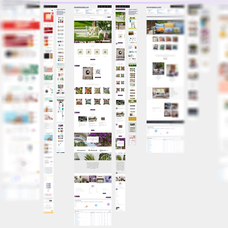
COMPETITOR ANALYSIS
I started off by analysing the client’s existing site. I used Lighthouse to conduct a superficial benchmark of the site. I then used Semrush to look at organic competitors, SEO keywords and competitive positioning.
I had to explain to the client that regardless of whether or not they considered another company to be a competitor, there were still other companies online that would receive Fabled Thread’s organic search traffic.
The organic search competitors I discovered using Semrush clearly illustrated that the client’s SEO was ineffective and/or completely missing. Some organic search competitors included a photographer, a phonetics website, and a Zen/mindfulness blog.
COMPETITIVE BENCHMARKING
I conducted a walkthrough of the client’s website to make observations, and uncovered a number of issues including no H1s on a lot of pages, CTAs that differed between desktop and mobile sites, a global nav that wasn’t sticky, redundant links, and some links that went to the wrong page. There were also significant problems with the checkout process.
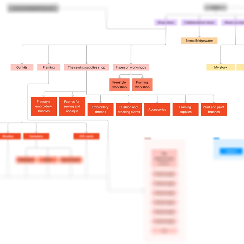
INFORMATION ARCHITECTURE OVERVIEW
I plotted out the information architecture of the site, which identified a few problems, such as some content being hosted on a micro site, redundant pages, and an over-complicated way of organising the shop. This also reconfirmed some of the links not going to the right pages.
USER FLOW ANALYSIS
I received user flow data from Google Analytics for the UK and US sites. The data suggested some bouncing back and forth between product pages, which suggested that visitors couldn’t find what they wanted. On the other hand, bounce rate was quite good. This ties in with the fact that most traffic to the site is direct.
ANALYSIS
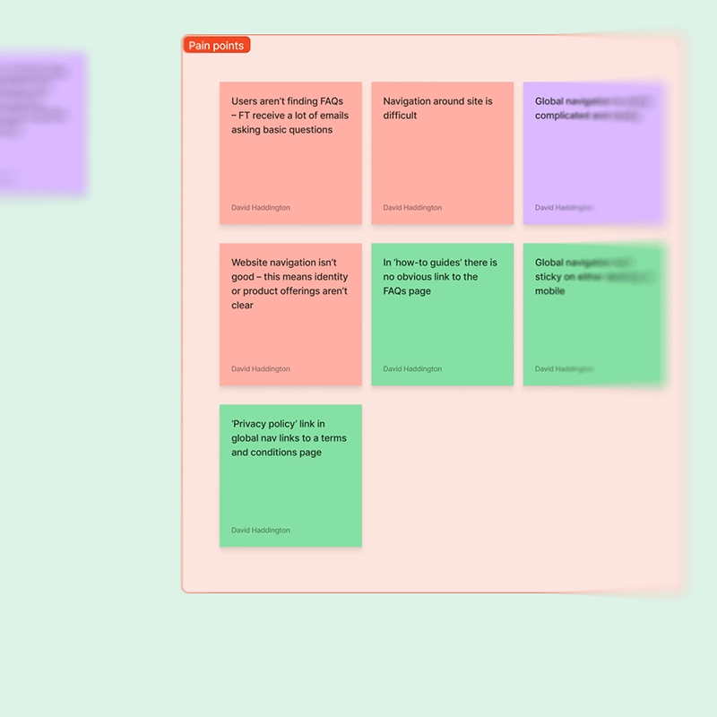
AFFINITY DIAGRAM
All of the data from the stakeholder interviews, SWOT analysis, quantitative data, competitor analysis and the user flows were plotted into an affinity diagram for assessment.
After sorting the diagram, the pain points were highlighted and became more obvious. These included the user journey through the site being unclear, problems with the checkout process, clunky and overcomplicated navigation, unclear information on product pages and SEO greatly lacking.
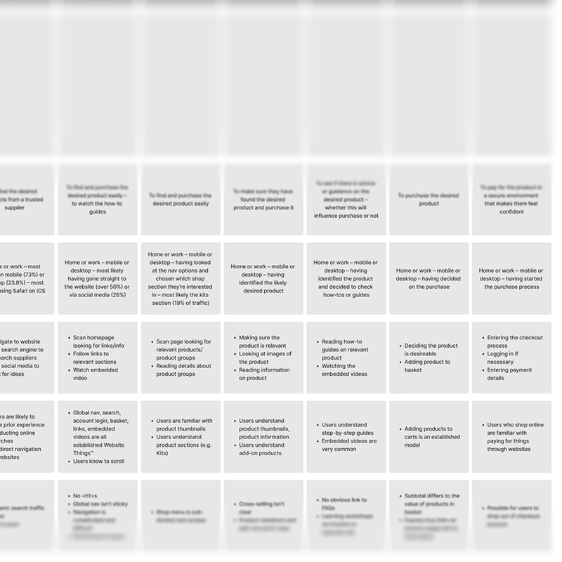
CUSTOMER JOURNEY MAP
The sorted data was taken from the affinity diagram and used to populate a customer journey map to clarify user goals and context, user behaviours, mental models and pain points. The map covered the journey from the user landing on the site to finishing the checkout process.
It was clear that there were problems at every stage of the customer journey that needed addressing.
WORKSHOP
I ran a client-facing workshop via video call, along with the UI designer, project lead, dev lead, and the client. A design-thinking model was used to sort through the output from the affinity diagram, and to create solutions to pain points.
IMPACT MAPPING
The solutions from the workshop were then impact-mapped internally by a team consisting of myself, a UI designer, project lead, dev lead, and marketing executive. During this process, we categorised each solution depending on whether it was low or high impact, and low or high effort. The solutions were compared to the statement of work produced for the client, to identify if any of them were out of scope. Once this was done, these solutions were then documented into the client report.
CLIENT REPORT
All of the information gathered so far during the research phase and the workshop was put into a branded report that was shared with the client. The report contained a summary of the project, the information and demographic breakdown from the UX research, the competitor information (including observations and insights), the outcomes from the workshop and impact mapping, and the conclusion and roadmap for the rest of the project.

DESIGN
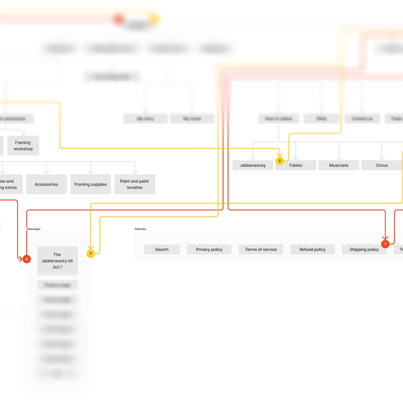
INFORMATION ARCHITECTURE
I worked with a UI designer to map the information architecture for the planned new site.
Because there were many existing issues with the navigation and user flow, I was very careful to streamline the architecture, incorporate the micro site into the main site, and dramtically simplify the organisation of the shop.
USER FLOWS
Using the information architecture diagram, I constructed several user flows for the new site.
Because the site’s architecture had changed considerably, I created a large number of granular user flows, including adding a product to the basket, signing up for membership, booking a course, blog paywall sign-in, editing user details, changing and cancelling subscription plans, and using loyalty points during checkout.

CONCLUSION
My goals for this project were to conduct the UX research and analysis to uncover and address any pain points, and therefore inform the UI design and development for the new site. I was able to uncover many problems with the existing site, and the solutions for these were passed on to and discussed with the UI designer and dev team.
Although my role had technically finished, I was also requested by the UI designer for input on the wireframes for this project, and in ongoing stakeholder meetings to provide consultancy.
In this project, I learned that sometimes you have to work very hard to try to communicate with stakeholders effectively to steer a project in the right direction. Sometimes, this involves collaborating and supporting other members of your team more closely.