Wood Burner Fuel Website
My role in this project was to conduct the research and analysis for the existing website, and the existing market, to inform the UI design and development of the new site.
THE BRIEF
My brief was to communicate with stakeholders, gather analytical data, analyse competitors, study click tracking and user flow, analyse the gathered data, facilitate a client workshop and produce user flows.
SOLUTION
During the project, I conducted the research and analysis, including the client workshop, producing a client report, and successfully handing the project across to UI design and development.
RESEARCH
STAKEHOLDER INTERVIEW
During stakeholder interviews, I asked the stakeholders questions over a video call, and compiled notes as they answered. I asked stakeholders about their business organisation, points of contact, and their desired perceptions of the brand.
I also asked about expected competitors, perceived strengths, weaknesses, opportunities and threats. As they had an existing website, I checked to see which analytics tools they had installed, and whether they had any basis for launching a user survey.
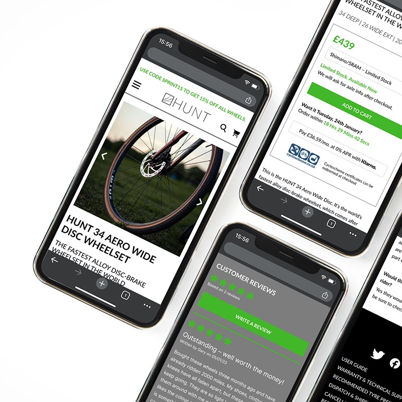
During the interview, we found that the client valued user-friendliness, clarity and honesty. They also noted that they were having some problems with their payment portal. There were also problems with the basket functionality on the mobile site, and their delivery cost information was unclear and confusing to customers. They also claimed to be struggling with sending out newsletters to interact with their current customer base.

SITUATIONAL ANALYSIS
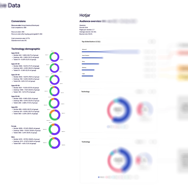
The first stage of the situational analysis was gathering existing analytics data from Google analytics and Hotjar. This allowed me to gather a quantitative overview of user and session numbers, recorded conversions and a demographic overview covering age ranges, gender split, and technology breakdown. This data was limited, as the client was still using Universal Analytics, and wasn’t tracking many conversions.
I discovered a roughly equal age-range spread, and that the majority of traffic came from mobile devices.
I used the information from the stakeholder interview and AI to construct a SWOT analysis.
COMPETITOR RESEARCH
I started off by analysing the client’s existing site. I used Lighthouse to conduct a superficial benchmark of the site. I then used Semrush to look at organic competitors, SEO keywords and competitive positioning.
I then used the client’s expected competitors and the discovered organic competitors to further research SEO keywords and competitive positioning.

INFORMATION ARCHITECTURE OVERVIEW
I used the sitemap to plot out the architecture of the existing site. During this process, I found that some of the product categories were redundant, and that the header links were overcrowding the header.

HEATMAPPING & CLICK-TRACKING
I used Hotjar to identify the most-visited pages on the site, and studied the recorded clicks, taps and scroll data for these pages. I found that due to the way the products were laid out on the page, the vast majority of clicks were to view the next page of products.

USER FLOW ANALYSIS
I used information from Google Analytics to investigate user flows on the existing site. I looked at a top-level user flow, and a couple of others, including a conversion user flow.
This data came from Universal Analytics, meaning it can be quite muddy. But the most clear user flows were plotted against the site map.

ANALYSIS
AFFINITY DIAGRAM
All of the data from the stakeholder interviews, SWOT analysis, quantitative data, Hotjar data, competitor analysis and the user flows were plotted into an affinity diagram for assessment.

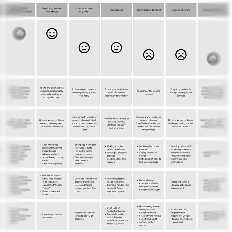
CUSTOMER JOURNEY MAP
The sorted data was taken from the affinity diagram and used to populate a customer journey map to clarify user goals and context, user behaviours, mental models and pain points. The map covered the journey from the user landing on the site to finishing the checkout process.
I discovered that, although users started off well on the website, when it came to adding products to their basket and paying for goods, there were significant pain points.
WORKSHOP
I ran a client-facing workshop via video call, along with the UI designer, project lead, dev lead, and the client. A design-thinking model was used to sort through the output from the affinity diagram, and to create solutions to pain points.
IMPACT MAPPING
The solutions from the workshop were then impact-mapped internally by a team consisting of myself, a UI designer, project lead, dev lead, and marketing executive. During this process, we categorised each solution depending on whether it was low or high impact, and low or high effort. The solutions were compared to the statement of work produced for the client, to identify if any of them were out of scope. Once this was done, these solutions were then documented into the client report.
CLIENT REPORT
All of the information gathered so far during the research phase and the workshop was put into a branded report that was shared with the client. The report contained a summary of the project, the information and demographic breakdown from the UX research, the competitor information (including observations and insights), the outcomes from the workshop and impact mapping, and the conclusion and roadmap for the rest of the project.

DESIGN
INFORMATION ARCHITECTURE
I worked with a UI designer to map the information architecture for the planned new site. We took into account customer journeys, mental models, and the perceived pain points users may experience.
USER FLOWS
Using the information architecture diagram, I constructed several user flows for the new site. This included top-level user purchase flow (including location functionality), a returning user making changes to their user account, a password reset flow, and a newsletter signup flow. These were then fed into the UI design and the site development.

CONCLUSION
My goals for this project were to conduct the UX research and analysis so that it could address the pain points uncovered, inform the UI design and the development for the newly-designed site. These were completed successfully, and the client report was approved without changes. I also received good feedback from the UI designer when the project was handed over to them.
I learned from this project how important heat mapping and click tracking is when looking at user behaviour. I also re-learned how infuriating Universal Analytics can be.